Creating New Components
Create a new component
Under the Create Component menu in the left sidebar, set a component name (required) and optionally select a parent component.
Then, click "Create Component" at the bottom of the menu.

Add HTML elements
Add HTML elements to your active component! Use the HTML Elements tab on the right sidebar.

Nest your HTML elements using our component focus modal or use the HTML Tab in the right sidebar.
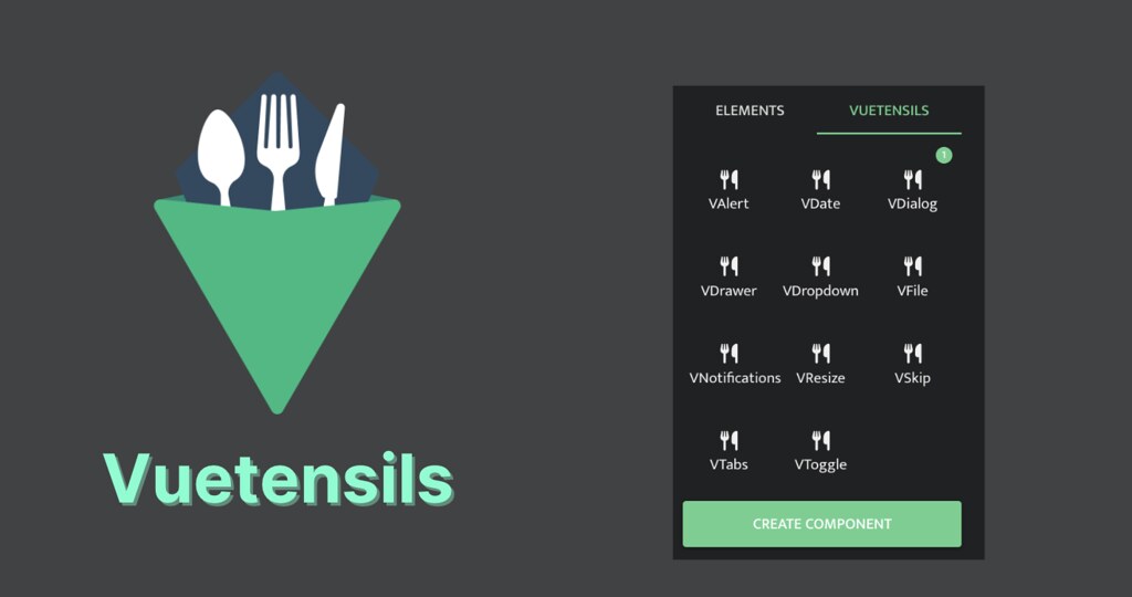
Vuetensils component library
OverVue now has a new feature to add accessible Vuetensils components to quickly style your project prototype components.
To add a Vuetensils component, click the Vuetensils tab and select the component you'd like to add.
Customize your components
To set component styling, add a class attribute.
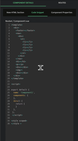
You can further customize your components in the sidebar by adding an ID, parents, children, props, state, or actions - all of which will be dynamically updated in the Code Preview and included in your exported files.
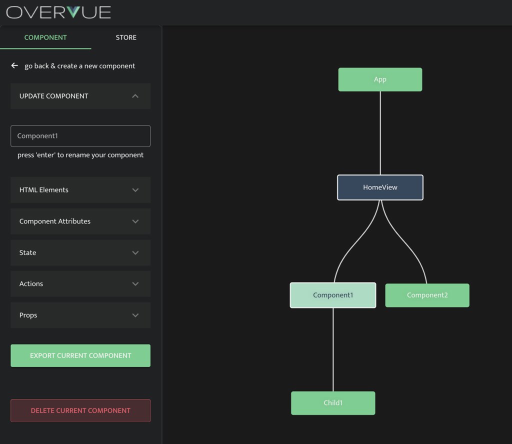
To update a component after its creation, select the component on the tree and the Update Component Menu will appear in the left sidebar.